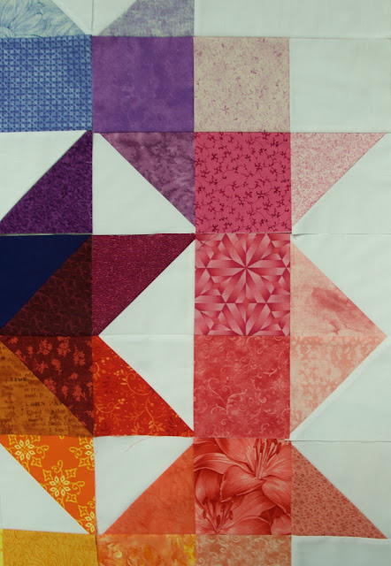
In fact, I finished the central star, this week's assignment, on Friday, but then I decided to replace some fabrics in the previously completed parts, so it had to wait. Unfortunately, I wasn't able to take good photos today, but wanted to be in time for the link-up, so here is the result:
In fact, this exercise helped me analyze my stash and I discovered that, although I have a nice range of colors, they are mostly in medium value, and I have few of the very light and very dark ones. So, I started to address this problem in my recent couple of visits to fabric shops)). Having bought some pastels, I decided to amend those pieces of the outermost circle that seemed most offensive. I replaced two and moved one triangle in the red part.
Another thing I learned in the process is that working with very light tints is more difficult - adding a lot of white to colors makes them really similar. I guess the same is true for dark shades, but in this example the darks were in the center so I needed fewer of them.
As I mentioned before, getting a dark shade of yellow is difficult - when you look at the yellow wedge you can see the value gradation, but the yellow in the central circles is obviously lighter than other colors. As far as I remember from reading about color theory, it's ok, it's just the characteristic of this color, but for the sake of consistency, I should have probably make it more brown.
Linking up to the Rainbow Rose QAL at Modern Quilters Ireland.


Looks beautiful. They blend brilliantly and I like the yellows - there is a lovely glow about it!
ReplyDeleteHa ha! I ended up with a trip to the fabric shop too. My stash was mssing blue.
ReplyDeleteI like how yours fades from a dark centre to lighter edges.